Principles Of Design In Photography

Great photos follow design principles. These principles make an image appealing and emotional. They help you frame shots, balance elements, and tell stories.
Mastering these principles improves your photography, whether you’re a beginner or an experienced photographer. This blog explains seven key principles clearly and easily.
Let’s dive in and explore how these simple rules can turn your photos from average to amazing.
1. Balance: Creating Visual Harmony

Balance is the key to turning photos into visual delights. When an image finds its balance, it looks effortlessly harmonious and easy on the eyes. Neither side feels too heavy or jarring – it’s simply picture-perfect. You skillfully guide the viewer’s gaze across the frame, making sure each part charms without overpowering.
There are two main types of balance in photography:
- Symmetrical Balance: The photo’s sides are perfect mirror images of each other. Imagine a calm reflection rippling on the water’s surface. A majestic building stands framed to perfection, exuding balance and harmony.
- Asymmetrical Balance: The elements dance in harmony, each side a unique spectacle. A grand subject reigns on one end, countered by a charming ensemble of smaller objects across the way. This delightful balance unveils a visual symphony, where differences unite to create an intriguing equilibrium.
2. Contrast: Adding Drama and Emphasis

Contrast makes your photo stand out. It adds visual interest by highlighting differences between elements—like light and dark, rough and smooth, or warm and cool colors. Without contrast, a photo appears flat and dull. The right contrast makes it bold and eye-catching.
One common way to use contrast is through light and shadow. For example, a bright subject on a dark background draws attention. But contrast isn’t only about brightness. You can also use it in:
- Color: Pair opposite colors like blue and orange for bold effects.
- Texture: Mix rough surfaces with smooth ones to add depth.
- Size and Shape: Place small objects next to large ones or soft shapes beside sharp edges.
3. Emphasis: Directing the Viewer’s Eye

Every great photo has a main focus. This is what grabs your attention. That’s where emphasis comes in. It helps guide your viewer to the right spot.
You create emphasis by highlighting your subject. This guides the eye toward it. Here are some ways to achieve this:
- Focus and Depth of Field: Blur the background to make the subject stand out sharply.
- Leading Lines: Use roads, fences, shadows, or architecture to naturally lead the eye to your subject.
- Color and Contrast: A splash of color in a neutral scene can instantly pull focus.
- Framing: Position your subject inside a window, doorway, or between objects to make it the center of attention.
4. Unity: Keeping It All Together

Unity brings all the parts of your photo together. It creates a feeling that everything in the frame shares the same mood, message, or story. Without unity, a photo can seem scattered or disconnected, even if each element looks good alone.
So how do you create unity in photography?
- Use a consistent color palette: Similar tones or complementary colors can tie your image together.
- Stick to a theme or mood: Whether it’s peaceful, moody, playful, or dramatic—let everything in the frame support that feeling.
- Repetition of shapes or elements: Patterns, similar objects, or repeating lines help create a flow.
- Background and setting: Choose environments that support your subject rather than distract from it.
5. Movement: Leading the Viewer’s Gaze

Movement in photography isn’t only about capturing action. It’s also about how the viewer’s eye flows through the image. Great photos direct the gaze, leading viewers from one part of the frame to another with intention.
You can create a sense of movement in two main ways:
- Actual motion: Like a person running, a bird flying, or cars with motion blur. This adds energy and tells a story in action.
- Visual flow: Even in still scenes, your composition can create a “path” for the viewer’s eye to follow.
Here are a few ways to create movement:
- Leading lines: Roads, rivers, fences, or shadows guide the eye naturally.
- Curves and diagonals: These shapes suggest flow and rhythm. They help the eye move smoothly across the photo.
- Subject direction: When your subject looks or moves a certain way, our eyes follow that path.
- Blur and long exposure: Capture motion while keeping the background still for dynamic effects.
6. Pattern & Repetition: Creating Rhythm
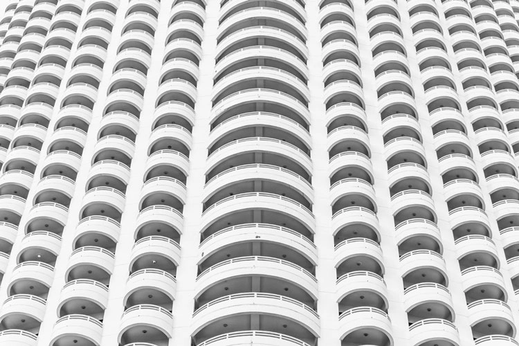
Patterns are everywhere—on floors, in buildings, among trees, or in crowds. In photography, pattern and repetition create rhythm and structure. They make images more interesting and satisfying to view.
Repetition catches our eyes. It keeps us engaged. But here’s the fun part—you can emphasize the pattern or break it for a dramatic effect.
Here’s how to use pattern and repetition in your photos:
- Find natural patterns: Look for repeated shapes, lines, colors, or objects in everyday scenes.
- Frame it tightly: Zoom in to fill the frame with the pattern for a bold, graphic look.
- Break the pattern: Add something unusual amid the repetition—like one red umbrella among black ones. This surprise grabs instant attention.
7. Space: Letting the Image Breathe

Space in photography isn’t just about what you see. It’s also about what you don’t see. It includes the area around and between your subject. This space greatly affects how your photo feels. When used well, it helps your image breathe, feel balanced, and tell a stronger story.
There are two main types of space:
- Positive space: The subject or main focus of your photo.
- Negative space: The empty or less detailed areas around the subject.
Negative space is powerful. It helps your subject stand out and adds simplicity. It can also evoke feelings like calmness, loneliness, or freedom. For instance, a person alone in a wide-open field feels different than someone in a cluttered space.
Here’s how to use space effectively:
- Keep it simple: Don’t be afraid of empty backgrounds—they often make your subject stronger.
- Use space to tell a story: Leave space in the direction your subject is looking or moving to create tension or peace.
- Balance your composition: Think about how much space your subject takes up and how it interacts with the rest of the frame.
To Conclude
Great photography is about seeing and telling a story. Seven design principles – balance, contrast, and others – can make your shots striking.
These principles are not strict rules. They are helpful guides to inspire your creativity. As you grasp them, you’ll see the world in new ways. This will help you create stronger connections with your audience.
Next time you shoot, focus on one principle. Practice it and play with it. Watch how it transforms your work. Photography blends skill and creativity. The more you grasp design, the stronger your images will be.


